【Android】shapeを使いviewを装飾する方法
- 作成日:2022/01/21
viewに少し凝った装飾をする方法です。 ボタンの角を丸くしたり色を変えたりと色々なことができます。
viewを装飾するには
viewの色を変えたりするなど単純ことはレイアウトファイルを修正すればできます。
ただし、角を丸くしたりするなど、少し凝ったものにするには、実現したい設定を書いたxmlファイルを別途用意して、それを読み込む必要があります。
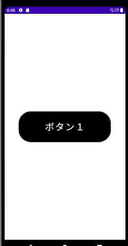
例として、ボタンの角を丸くしたい場合を考えてみます。まずはレイアウトファイルを以下のようにします。
<?xml version="1.0" encoding="utf-8"?>
<androidx.coordinatorlayout.widget.CoordinatorLayout xmlns:android="http://schemas.android.com/apk/res/android"
    xmlns:tools="http://schemas.android.com/tools"
    android:layout_width="match_parent"
    android:layout_height="match_parent"
    xmlns:app="http://schemas.android.com/apk/res-auto"
    tools:context=".MainActivity">

    <Button
        android:id="@+id/button"
        android:layout_width="300dp"
        android:layout_height="100dp"
        android:text="ボタン1"
        android:layout_gravity="center"
        android:textSize="30sp"
        android:textColor="#fff"
        app:backgroundTint="@null"
        android:background="@drawable/shape1"
        />

</androidx.coordinatorlayout.widget.CoordinatorLayout>
18行目でshape1ファイルを読み込んでいるのがポイントです。 読み込むファイルはdrawableフォルダに置きます。
shape1の内容は次の通りです。
<?xml version="1.0" encoding="utf-8"?>
<shape xmlns:android="http://schemas.android.com/apk/res/android"
    android:shape="rectangle">
    <corners android:radius="40dp" />
    <solid android:color="#000000" />
</shape>
細かい説明は後述しますが、ここでは色と丸みを設定しています。これを実行すると次のようになります。
このように、viewに対して細かい装飾をしたい場合は、別途xmlファイルを用意して、その中でshapeを使い装飾を記述して、 それを読み込むようにします。
shapeの使い方
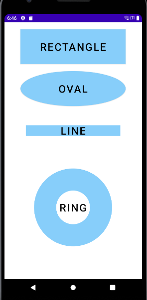
shapeを使うとどんなことができるのかを解説していきます。 まず、shapeには「rectangle、oval、line、ring」の4種類の形状が用意されています。
実際に書いてみましょう。
基本
shapeには次のような装飾が可能です。
| 要素名 | 説明 |
|---|---|
| <corners> | 角を丸くする |
| <gradient> | グラデーションを設定する |
| <padding> | 余白を設定する |
| <size> | サイズを設定する |
| <solid> | 色を設定する(単色) |
| <stroke> | 枠線を設定する |
形状によっては他の設定もできますが、まずはこれらを基本として覚えると良いでしょう。
では実際に書いてみます。 drawableフォルダにshape.xmlというxmlファイルを置いて、そのファイルにviewの装飾設定をしていきます。
<?xml version="1.0" encoding="utf-8"?>
<shape xmlns:android="http://schemas.android.com/apk/res/android"
    android:shape="rectangle">
    <corners android:radius="10dp" />
    <stroke
        android:width="10dp"
        android:color="#0000ff"/>
    <solid android:color="#87cefa" />
</shape>- 4行目・・・形状を指定しています。今回は「rectangle」を使います。
- 5行目・・・角の丸みを設定しています。
- 6~8行目・・枠線を設定しています。
- 9行目・・・色を設定しています。
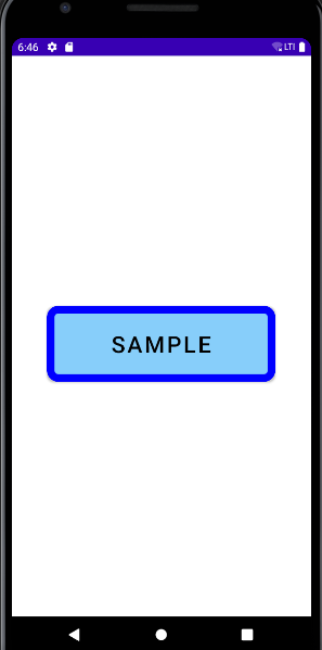
これをレイアウトファイルで読み込みます。 今回はボタンの背景に装飾を適用してみます。
<?xml version="1.0" encoding="utf-8"?>
<androidx.coordinatorlayout.widget.CoordinatorLayout xmlns:android="http://schemas.android.com/apk/res/android"
    xmlns:tools="http://schemas.android.com/tools"
    android:layout_width="match_parent"
    android:layout_height="match_parent"
    xmlns:app="http://schemas.android.com/apk/res-auto"
    tools:context=".MainActivity">

    <Button
        android:id="@+id/button"
        android:layout_width="300dp"
        android:layout_height="100dp"
        android:layout_marginTop="20dp"
        android:text="sample"
        android:layout_gravity="center"
        android:textSize="30sp"
        android:textColor="#000"
        app:backgroundTint="@null"
        android:background="@drawable/shape"
        />

</androidx.coordinatorlayout.widget.CoordinatorLayout>
19行目の「app:backgroundTint」の設定は忘れないようにしましょう。 ボタンの背景設定に独自の設定を適用する場合、これがないとうまく反映されません。
20行目でshape.xmlファイルを読み込みます。「@drawable/ファイル名」という形式で指定します。 拡張子は不要です。
ソースコードは次の通りです。
package com.example.androidkoko;

import android.os.Bundle;
import android.view.View;
import android.widget.Button;
import android.widget.TextView;
import androidx.appcompat.app.AppCompatActivity;

public class MainActivity extends AppCompatActivity {

    @Override
    protected void onCreate(Bundle savedInstanceState) {
        super.onCreate(savedInstanceState);
        setContentView(R.layout.activity_main);
    }
}
単純にレイアウトファイルを読み込んでいるだけですね。 実行すると次のようになります。